
I was reminded of this, this week while designing a leaflet for a client.
Like many businesses, their marketing materials had been created by different people, at different times. The logo was fine, but there wasn’t really a consistent visual style around it.
And that’s something you can be changed without redesigning the logo. By taking the existing logo, colours and typefaces as a starting point, you can begin to build a much stronger brand around them.

I can introduce a more considered photographic style – even using stock photography in a way that feels distinctive rather than obviously ‘stock’. I can develop a consistent tone of voice. And, importantly, I can rethink the content so it talks less about how a service is delivered and more about the value it gives the customer.
Apply that thinking consistently across leaflets, brochures, websites, social media and other marketing, and a much stronger brand begins to emerge.
And it doesn’t necessarily add to the cost. This approach can simply become part of the creative thinking behind the first new piece of design.
The client I was working with was really pleased with the new visual style, but also particularly appreciated the change in the content – because it made what they were saying much more relevant to their market.
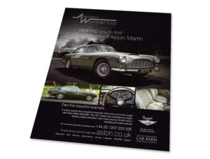
The advert and car brochure shown here are actually another example of the same approach. I designed it around an existing logo rather than creating a new identity. The client later told me it was the most effective piece of print they had ever commissioned.
That was back in 2010. Considering it’s now 16 years old, I think it’s stood the test of time pretty well.
Sometimes a business doesn’t need a new logo. It just needs a stronger brand built around the one it already has.